
Mastering the Color Wheel: How to Create Stunning Designs with Perfect Color Harmony

Color is more than just an aesthetic choice—it’s a powerful tool that influences emotions, enhances communication, and creates visually compelling designs. Whether you’re designing a website, branding a product, or painting a masterpiece, understanding the color wheel and its principles is essential for achieving harmony and impact. Wear veteran apparel with amazing color options.
The Foundation: Understanding the Color Wheel
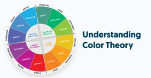
The color wheel is the backbone of color theory, a visual representation of colors arranged by their relationships. It consists of primary, secondary, and tertiary colors, which form the basis for creating harmonious palettes.
- Primary Colors: Red, blue, and yellow—these are pure colors that cannot be created by mixing others.
- Secondary Colors: Green, orange, and purple—these are created by mixing two primary colors.
- Tertiary Colors: Formed by mixing a primary and a secondary color, such as red-orange or blue-green, these colors add depth to any palette.
By using the color wheel as a guide, designers can create color combinations that are visually appealing and balanced.
The Power of Color Harmony
Color harmony is the art of combining colors in a way that is aesthetically pleasing. When colors work well together, they create a sense of balance and cohesion. There are several color harmony principles that can help you craft stunning designs:
Complementary Colors: High Contrast & Bold Statements
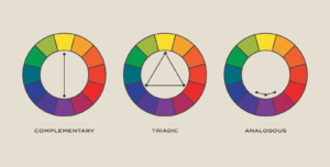
Complementary colors are positioned directly opposite each other on the color wheel, such as blue and orange or red and green. This contrast creates a striking visual effect, making complementary color schemes perfect for designs that need to stand out.
For example, in branding, Nike’s orange logo on a blue background commands attention. In nature, the vivid contrast of a sunset’s oranges and purples captivates the eye. However, complementary color schemes should be used carefully—too much contrast can be overwhelming. To balance it out, use one color as the dominant shade and the other as an accent.
Analogous Colors: Smooth & Natural Harmony
Analogous color schemes involve colors that sit next to each other on the color wheel, such as blue, teal, and green or red, orange, and yellow. These color combinations create a harmonious and soothing effect, making them ideal for calm, professional, and nature-inspired designs.
A great example is found in sunset photography, where warm shades of orange, pink, and yellow seamlessly blend into each other. In design, analogous colors work well in websites, branding, and interior design, offering a visually cohesive and sophisticated look.
Triadic Colors: Vibrant & Energetic Balance
Triadic color schemes use three colors evenly spaced around the color wheel, such as red, yellow, and blue or purple, green, and orange. This combination offers both contrast and balance, making it highly dynamic and engaging.
Children’s brands often leverage triadic color schemes because they create a lively, energetic feel. McDonald’s red, yellow, and blue color palette is a prime example, evoking excitement and playfulness. If you use this scheme, ensure one color dominates while the others serve as accents to avoid overwhelming the viewer.
Monochromatic Colors: Elegant & Minimalist Appeal
A monochromatic color scheme consists of different shades, tints, and tones of a single color. This approach is timeless and elegant, often used in minimalist designs, luxury branding, and sleek modern interiors.
For instance, a monochromatic blue palette can create a sense of calm and professionalism, perfect for corporate websites. Meanwhile, using various shades of pink in fashion branding evokes femininity and sophistication. This scheme ensures consistency and balance without the risk of clashing colors.
Split-Complementary Colors: A Softer Alternative
The split-complementary color scheme involves a base color and the two colors adjacent to its complement. Instead of using red and green, a split-complementary approach would use red, blue-green, and yellow-green.
This combination provides contrast without the intensity of direct complements. It’s often used in infographics, presentations, and digital designs where a balanced yet engaging look is needed.
The Psychology of Color: Evoking Emotion in Design
Color isn’t just about aesthetics—it influences emotions and behaviors. Choosing the right colors for your designs requires an understanding of color psychology and its impact on perception.
- Red: Passion, energy, urgency—often used in food, retail, and sports branding (e.g., Coca-Cola, Target).
- Blue: Trust, calm, reliability—commonly seen in corporate and tech industries (e.g., Facebook, IBM).
- Yellow: Optimism, warmth, attention-grabbing—popular in creative and playful branding (e.g., McDonald’s, Snapchat).
- Green: Nature, health, growth—used in environmental and wellness industries (e.g., Whole Foods, Starbucks).
- Purple: Luxury, creativity, mystery—frequently seen in beauty and high-end brands (e.g., Cadbury, Hallmark).
- Black: Sophistication, power, elegance—used in luxury fashion and modern minimalist design (e.g., Chanel, Apple).
Understanding the emotional impact of colors allows designers to create branding, marketing, and visual content that connects with audiences on a deeper level.
Tips for Achieving Color Harmony in Design
While the color wheel offers a solid foundation, real-world application requires thoughtful execution. Here are key tips to ensure color harmony in your designs:
Use a Dominant Color

Select one primary color that will be the most prominent in your design. Whether it’s a bold red for a call-to-action button or a cool blue for a calming website background, establishing a dominant color helps maintain focus and balance.
Apply the 60-30-10 Rule
A popular design principle, the 60-30-10 rule suggests dividing colors into:
- 60% dominant color (background or main elements)
- 30% secondary color (supporting accents)
- 10% accent color (small highlights to create contrast)
This strategy ensures a balanced and visually appealing composition.
Consider Contrast for Readability
When designing text-heavy visuals such as web pages, presentations, or branding materials, contrast is crucial. Light text on a dark background or vice versa enhances readability and accessibility. For instance, black text on a white background is the most readable combination.
Experiment with Shades and Tints
Instead of using flat colors, play with tints (adding white), shades (adding black), and tones (adding gray) to introduce depth and sophistication. This technique is especially useful in branding, as it adds versatility while maintaining consistency.
Test Colors on Different Devices
Colors can appear differently on screens based on brightness, contrast, and display settings. Always test your color choices across multiple devices to ensure consistency in print and digital formats.
Mastering Color Harmony for Stunning Designs
Mastering the color wheel is more than just picking pretty colors—it’s about creating harmony, evoking emotions, and ensuring visual impact. By understanding complementary, analogous, triadic, monochromatic, and split-complementary schemes, along with the psychological effects of colors, you can craft designs that captivate, engage, and leave a lasting impression.
Whether you’re a graphic designer, web developer, artist, or marketer, leveraging color harmony will elevate your work, ensuring every design is visually stunning and perfectly balanced. Keep experimenting, trust your creative instincts, and let the power of color transform your designs into masterpieces.


