
How to Choose the Perfect Color Palette for Your Space as a Beginner
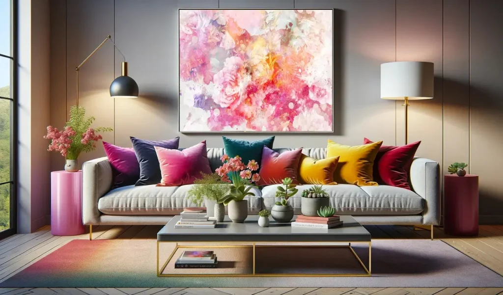
Creating a harmonious and visually appealing space begins with selecting the right color palette. As a beginner, navigating the endless spectrum of colors can feel overwhelming, but with the right guidance, you can transform your space into a reflection of your personality and style. Choosing colors isn’t just about what looks good—it’s about how colors make you feel, how they interact with light, and how they complement the purpose of your room.
Understanding the Psychology of Color
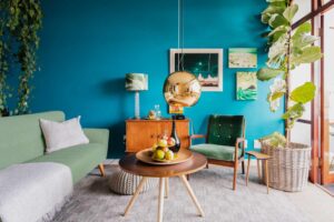
Before diving into the technicalities, it’s essential to grasp the emotional and psychological impact of colors. Colors have the power to evoke moods, set tones, and even influence behavior. For example, blue is often associated with calmness and serenity, making it ideal for bedrooms or relaxation spaces. On the other hand, yellow exudes energy and optimism, making it a great choice for kitchens or creative workspaces. Understanding these emotional undertones will help you decide how you want each room to feel.
It’s also important to consider cultural or personal associations with colors. While red may signify passion and energy in some contexts, it could evoke a sense of warmth and tradition for others. Take time to reflect on how colors resonate with you personally.
Starting with a Neutral Base
One of the simplest ways to approach a color palette is by starting with a neutral base. Neutral tones, such as whites, grays, and beiges, provide a versatile foundation that pairs well with almost any color. These hues also create a sense of balance, allowing you to layer in accent colors without overwhelming the space.
Neutrals are particularly beneficial for beginners because they create a timeless backdrop. If you’re unsure of your long-term preferences, a neutral foundation ensures flexibility. You can easily swap out accessories, like pillows or rugs, to change the vibe of a room without committing to a dramatic wall color. For those looking to add a personal touch, consider incorporating veteran made apparel as unique and meaningful decor accents.
Exploring the Color Wheel
The color wheel is a beginner’s best friend when it comes to choosing a palette. This circular diagram showcases the relationships between primary, secondary, and tertiary colors. While it might sound technical, it’s surprisingly straightforward once you get the hang of it.
Complementary colors are pairs found opposite each other on the wheel, like blue and orange. These combinations create high contrast and vibrant energy, perfect for bold statements. Analogous colors, on the other hand, are found next to each other, such as green, yellow-green, and yellow. These combinations offer a more harmonious and soothing look.
If you want to keep things simple, stick to a monochromatic scheme, which involves variations of a single color. For example, a light blue wall paired with navy accents creates depth while maintaining cohesion.
Considering Lighting in Your Space
Lighting plays a crucial role in how colors appear. A paint sample that looks stunning in the store may look completely different under the lighting in your home. Natural light, artificial light, and even the time of day can influence how colors are perceived.
In rooms with plenty of natural light, you can experiment with deeper or brighter shades. However, in spaces with limited light, opt for lighter colors to make the room feel larger and more open. For a creative touch, consider incorporating accessories like trucker hats as part of your room’s decor, adding a playful and personal vibe to the space. It’s always a good idea to test paint swatches in your space at different times of day before committing to a full wall or room.
Warm lighting can enhance earthy tones like reds and yellows, while cool lighting may complement blues and greens better. If your space has mixed lighting sources, aim for a palette that works well in both scenarios.
Drawing Inspiration from Your Environment
Sometimes the best ideas come from what’s already around you. Look for inspiration in your favorite pieces of furniture, artwork, or even nature. A stunning painting or a cherished rug can act as a centerpiece for your color palette.
Nature is another great source of inspiration. Think about the calming blues and greens of a forest, the warm earth tones of a desert, or the cheerful hues of a flower garden. These natural combinations are timeless and inherently balanced, making them ideal for beginners. If you’re looking to transform your home with these inspiring colors, consider working with a home improvement contractor in Danbury to bring your vision to life.

If you’re struggling to decide, take a look at color palettes used in professionally designed spaces online or in magazines. While you shouldn’t copy them exactly, they can spark ideas and give you a sense of what works well together.
Balancing Bold and Subtle Tones
Striking the right balance between bold and subtle tones is key to creating a visually appealing space. While bold colors can add character and drama, too much intensity can overwhelm the senses. On the other hand, overly muted tones can make a room feel dull or uninspired. For those interested in music, finding chromatic harmonicas for sale can bring a touch of creativity and rhythm to the atmosphere.
A common rule of thumb is the 60-30-10 rule: 60% of the room’s color should be a dominant shade, such as the walls. 30% should be a secondary color, often found in furniture or textiles, and 10% should be an accent color used sparingly for decorative items. This approach ensures harmony while allowing for pops of personality.
For example, in a living room, a neutral beige might dominate, complemented by navy furniture and pops of mustard yellow in throw pillows and artwork. This creates a dynamic yet balanced look.
Testing Colors in Small Doses
As a beginner, committing to a bold paint color or a large piece of colorful furniture can feel intimidating. Instead, start small. Test your chosen colors through accessories, like cushions, curtains, or even a statement vase. This allows you to see how the colors work in your space without making major changes. If you’re also managing business finances, exploring small business debt relief options can help create the breathing room you need to focus on other areas, like updating your home or workspace.
Another helpful tip is to use sample pots of paint. Apply them to small sections of your walls and observe how they look at different times of day. This trial-and-error approach gives you confidence in your choices and prevents costly mistakes.
Considering the Flow Between Rooms
If you’re working on multiple rooms, it’s important to think about how colors flow between spaces. While each room can have its own identity, there should be some level of cohesion to avoid a jarring transition. Choosing a unifying neutral or repeating an accent color in different ways can create a sense of continuity.
For example, if your living room features soft blues and grays, you might carry the blue into the dining room through a piece of art or a patterned tablecloth. This subtle repetition ties the spaces together without being overly matchy.
Avoiding Common Mistakes
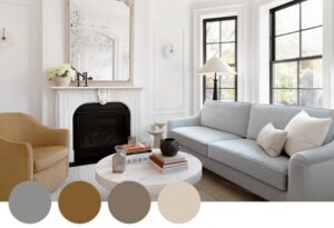
Beginners often make the mistake of choosing colors that are too trendy or overly bold without considering their long-term appeal. While trends can be exciting, they may not age well. Focus on what genuinely resonates with you rather than what’s currently in style. Another common pitfall is not considering the existing elements in your space, such as flooring, cabinetry, or permanent fixtures. Always choose colors that complement these features rather than clash with them. For those looking to transform their overall lifestyle, exploring medical weight loss in Wisconsin can be a great step toward achieving long-term health goals that align with your personal needs and preferences.
Overloading a space with too many colors can also create visual chaos. Stick to three to five main colors in varying proportions for a cohesive look. Lastly, don’t forget to account for texture and pattern, as these can add depth and interest to your palette.
Trusting Your Instincts
Ultimately, the best color palette is one that makes you feel happy and comfortable. While expert advice and design principles are helpful, your instincts play an equally important role. If a color combination feels right to you, it likely will work in your space.
Experimentation is part of the process, and it’s okay to make adjustments as you go. Over time, you’ll develop a better sense of what works for your style and space, making future design projects even more enjoyable.
Bringing It All Together
Choosing the perfect color palette as a beginner doesn’t have to be a daunting task. By understanding the basics of color psychology, leveraging tools like the color wheel, and testing colors in small doses, you can create a space that reflects your personality and meets your practical needs. Balance is key, whether you’re mixing bold and subtle tones, ensuring flow between rooms, or working with lighting and existing features.
Above all, enjoy the process. Designing your space is an opportunity for self-expression and creativity. With a thoughtful approach and a willingness to experiment, you’ll find the perfect palette that turns your house into a home.