
Color Theory 101: Essential Principles and How to Apply Them in Your Color Palette

Color theory is an essential aspect of design, art, and even everyday decision-making. Understanding how colors interact, their psychological impacts, and how to create harmonious color schemes can transform a simple project into a masterpiece. This guide delves into the fundamental principles of color theory and offers practical tips on how to apply them in creating your own color palette.
The Basics of Color Theory
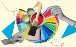
Color theory begins with the color wheel, a visual representation of colors arranged according to their chromatic relationship. Primary colors, which are red, blue, and yellow, cannot be created by mixing other colors. These form the foundation from which all other colors are derived. Secondary colors, green, orange, and purple, are created by mixing primary colors. Further, tertiary colors are the result of mixing a primary color with a secondary color, leading to hues like red-orange or blue-green.
Understanding the relationships between these colors is crucial. The color wheel helps in identifying complementary colors, which are opposite each other on the wheel and create high contrast and vibrant looks. Analogous colors, on the other hand, sit next to each other on the wheel and often match well, providing serene and comfortable designs. Triadic color schemes use three colors that are evenly spaced around the wheel, offering strong visual contrast while retaining harmony.
Moreover, colors can be described in terms of their hue, saturation, and brightness. Hue refers to the color itself, saturation describes the intensity of the color, and brightness indicates how light or dark the color is. By manipulating these elements, designers can achieve a wide range of effects and moods. For instance, a highly saturated color can evoke strong emotions and draw attention, while a desaturated, muted color can be more calming and subdued. In a similar way, trading courses can teach individuals how to analyze and manipulate market trends to achieve desired financial outcomes.
Psychological Effects of Colors
Colors have a profound psychological impact and can influence moods, perceptions, and behaviors. Red, for example, is often associated with passion, energy, and urgency. It can increase heart rates and create a sense of excitement. In contrast, blue tends to evoke calmness, trust, and stability. This is why many corporate logos and social media platforms use blue to convey reliability and professionalism. Additionally, vibrant and playful colors are often used in advertisements, such as those for Frenchies for sale, to attract attention and convey a sense of fun and joy.
Green, commonly associated with nature and tranquility, can promote a sense of peace and renewal. It’s a popular choice in environments meant to be relaxing or rejuvenating, such as spas or wellness centers. Yellow, often seen as cheerful and energetic, can stimulate mental activity and generate a sense of warmth. However, it can also be overpowering if used excessively.
Additionally, purple is linked to luxury, creativity, and wisdom. It can add a touch of elegance and sophistication to a design. Meanwhile, black exudes power, elegance, and formality, often used in high-end fashion and luxury products. White represents purity, simplicity, and cleanliness, making it a staple in minimalist designs and spaces intended to feel open and airy.
Understanding these psychological effects allows designers to choose colors that not only look good together but also convey the desired emotional tone. A full-service marketing agency in Green Bay can help businesses utilize these color strategies effectively. By carefully selecting and combining colors, it’s possible to create environments and products that resonate on a deeper emotional level with their audience.
Creating Harmony with Color Schemes
Creating a harmonious color palette involves more than just picking a few colors that look good together. It requires a strategic approach to ensure that the colors complement each other and the overall design purpose. One of the most straightforward methods is using monochromatic color schemes, which involve different shades, tints, and tones of a single color. This can create a cohesive and sophisticated look without the risk of clashing colors.
Analogous color schemes, which use colors that are next to each other on the color wheel, offer a balanced and serene appearance adjusting these properties, you can create a diverse range of visual effects and moods in your designs. For instance, a high-saturation color can appear bold and vibrant, while a desaturated version of the same hue might feel more subdued and sophisticated. Brightness adjustments can further influence the perceived energy of a color, with lighter colors often feeling airy and expansive, and darker colors appearing more grounded and intense.
Psychological Effects of Color
Colors can evoke specific emotional responses and behaviors, making the psychological effects of color a powerful tool in design and communication. Red, for example, is often associated with passion, energy, and urgency. It can stimulate excitement and increase heart rates, making it a popular choice for call-to-action buttons and warning signs. However, its intensity also means it should be used sparingly to avoid overwhelming the viewer.
Blue, conversely, is frequently linked to calmness, trust, and professionalism. It is a common choice for corporate branding and websites where a sense of reliability and stability is desired. The calming nature of blue makes it ideal for environments meant to reduce stress, such as healthcare settings or spa services.
Yellow is typically associated with happiness, optimism, and warmth. Its bright and cheerful nature can grab attention and create a sense of energy. However, too much yellow can sometimes lead to feelings of anxiety or frustration. Therefore, it’s often best used as an accent color rather than a dominant hue. For hobbies like painting RC car bodies, yellow can be a popular choice for adding vibrancy and visibility on the track.
Green, symbolic of nature and tranquility, often conveys health, growth, and freshness. It’s widely used in environmental and wellness-related designs. Purple, historically associated with royalty and luxury, can also bring about a sense of mystery and creativity. Each color holds the power to influence perception and mood, so understanding these psychological impacts is crucial when selecting colors for your palette.
Creating Harmonious Color Schemes
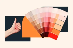
Achieving a harmonious color scheme involves more than just picking colors that look good together. It requires an understanding of color relationships and how they interact. One effective approach is the monochromatic scheme, which uses variations in lightness and saturation of a single color. This creates a cohesive and soothing look that is easy on the eyes.
Analogous color schemes involve selecting colors that are next to each other on the color wheel. This method offers more variety than a monochromatic scheme while still maintaining harmony. For instance, a palette of blue, blue-green, and green can evoke the calmness of the sea and nature.
Complementary color schemes, which use colors opposite each other on the color wheel, create high contrast and can make elements stand out. This method is excellent for drawing attention to key areas of a design but requires careful balance to avoid clashing. For example, pairing blue with orange can be striking but should be managed to ensure the overall look is not too jarring.
Split-complementary schemes offer a twist on the complementary approach by using a base color and the two colors adjacent to its complement. This results in a balanced yet vibrant palette. For instance, combining blue with yellow-orange and red-orange can provide a pleasing contrast without the intensity of a direct complementary scheme. When exploring color schemes for interior design projects, consulting with Stevens Point attorneys can ensure legal compliance and protection of intellectual property rights related to design concepts.
Practical Application in Design
Applying color theory principles in design starts with understanding the purpose and audience of the project. For instance, designing a children’s website might benefit from bright, primary colors to evoke fun and excitement. On the other hand, a financial institution’s branding may lean towards blues and greys to project trustworthiness and stability. When considering interior design, integrating elements like roller shades in Newport Beach can further enhance the ambiance and functionality of a space.
Start by defining the mood you wish to convey. If you want to create a serene and calming atmosphere, you might choose a palette dominated by cool blues and greens. Conversely, if you’re aiming for something energetic and dynamic, warmer hues like reds, oranges, and yellows could be more appropriate.
Consider the cultural context as well. Colors can have different meanings in different cultures. For example, while white is often associated with purity in Western cultures, it is linked to mourning in some Eastern cultures. Understanding these cultural nuances ensures your color choices are appropriate and effective for your intended audience.
Tools and Techniques for Building Color Palettes
Several tools can help you build and refine your color palettes. Digital tools like Adobe Color, Coolors, and Paletton allow you to experiment with different schemes and see how colors look together. These tools often provide features to adjust hues, saturation, and brightness, helping you to fine-tune your palette. Interestingly, some online platforms even feature ads for captive animals for sale, highlighting a diverse range of available services.
When starting from scratch, you might begin by selecting a base color that represents the primary mood or theme of your design. From there, use the color wheel to explore complementary, analogous, or triadic colors that enhance your base. These tools can also simulate color blindness and other visual impairments, ensuring your palette is accessible to a broader audience.
Swatch libraries, available in most design software, offer predefined palettes based on various themes and trends. These can serve as a useful starting point or source of inspiration. Furthermore, observing nature, art, and fashion can provide real-world examples of harmonious color usage that you can adapt to your projects.
Testing and Refining Your Palette
Once you have a preliminary palette, it’s crucial to test it in context. Apply the colors to your design elements and evaluate how they interact. Does the background color make the text easy to read? Are the accent colors drawing attention to the right areas? Does the overall scheme convey the desired mood?
Gathering feedback is an essential part of this process. Share your design with others to get their impressions. What emotions do the colors evoke? Are there any readability issues? This feedback can highlight potential problems you might not have noticed and provide valuable insights for refinement.
Be prepared to make adjustments. Sometimes colors that seem perfect in isolation may not work as well when combined. Tweaking the saturation, brightness, or even the hue can make a significant difference. Continuously refining your palette based on real-world application and feedback will lead to a more effective and aesthetically pleasing design. For instance, when designing the interiors of a commercial kitchen, the choice of colors might need to complement the restaurant equipment used.
Maintaining Consistency Across Projects

Consistency in color usage is vital for establishing a strong brand identity. Once you’ve developed a successful palette, create a style guide that outlines the specific colors and how they should be used. This guide should include color codes for digital and print formats, examples of proper usage, and any variations that are acceptable.
Ensure that everyone involved in the project understands and adheres to the style guide. Consistent application of colors across different platforms and materials helps in creating a cohesive brand image. For instance, using the same shades in your website, social media, and print materials reinforces brand recognition and professionalism.
Regularly review and update your color palette to keep it fresh and relevant, whether you’re designing a new website or envisioning a space. This attention to detail is as important as finding a reliable residential plumber in Santa Clara. While consistency is crucial, being adaptable to trends and changes in your industry can also be beneficial. A well-maintained and thoughtfully updated palette ensures your designs remain contemporary and engaging.
Conclusion
Mastering color theory is a journey that combines understanding fundamental principles with practical application. By learning the basics of the color wheel, recognizing the psychological impacts of different hues, and creating harmonious color schemes, you can significantly enhance your design projects. Practical tools and techniques, along with diligent testing and refinement, allow you to build effective and appealing color palettes tailored to your specific needs. For professionals looking to deepen their expertise, gaining a project management certification can also streamline the execution of complex design projects.
Remember, consistency in color usage is key to establishing a strong and recognizable brand identity. Regularly updating your color palettes ensures they remain relevant and engaging in a rapidly changing visual landscape. Overcoming challenges such as contrast issues and device discrepancies is part of the process, but with careful consideration and the right tools, these can be managed effectively. And don’t forget about the importance of online presence; optimizing keywords like best Asian massage in Las Vegas can drive targeted traffic to your site.
Ultimately, color theory offers a powerful toolkit for creating compelling designs that resonate with your audience. Whether you’re crafting a website, a brand identity, or any visual project, applying these principles thoughtfully will help you achieve a polished and professional result. Embrace the vibrant world of color theory and let it guide you in creating visually stunning and emotionally impactful designs.